Checkout Redesigned
Client
Subsbase
Year
2023
This project led the complete UX overhaul of SubsBase's checkout experience, transforming a cluttered, single-page signup form into a structured, transparent, mobile-friendly purchase flow. The redesign consolidated plan selection, add-on customization, cost breakdown, and payment into one cohesive decision surface, replacing a checkout that had become the weakest link in SubsBase's conversion funnel.
The work shaped the interaction and visual foundation that subsequent SubsBase merchant-facing surfaces were built on.
Scope of Work

Goals
Success meant moving SubsBase's checkout from a dense configuration form into a decision moment users could move through with confidence, without sacrificing the flexibility merchants required for multi-tier, multi-add-on billing. Three goals anchored the project:
Make customization legible, every plan, add-on, quantity, and tier had to be configurable without overwhelming the user or hiding downstream cost implications.
Expose full cost before commitment, setup fees, plan fees, per-tier pricing, taxes, trial behavior, and auto-renewal terms had to be visible before the user reached the payment step.
Elevate payment into a credibility moment, payment methods had to feel branded and trustworthy across desktop and mobile, not bolted onto the end of the flow.
Research & Analytics
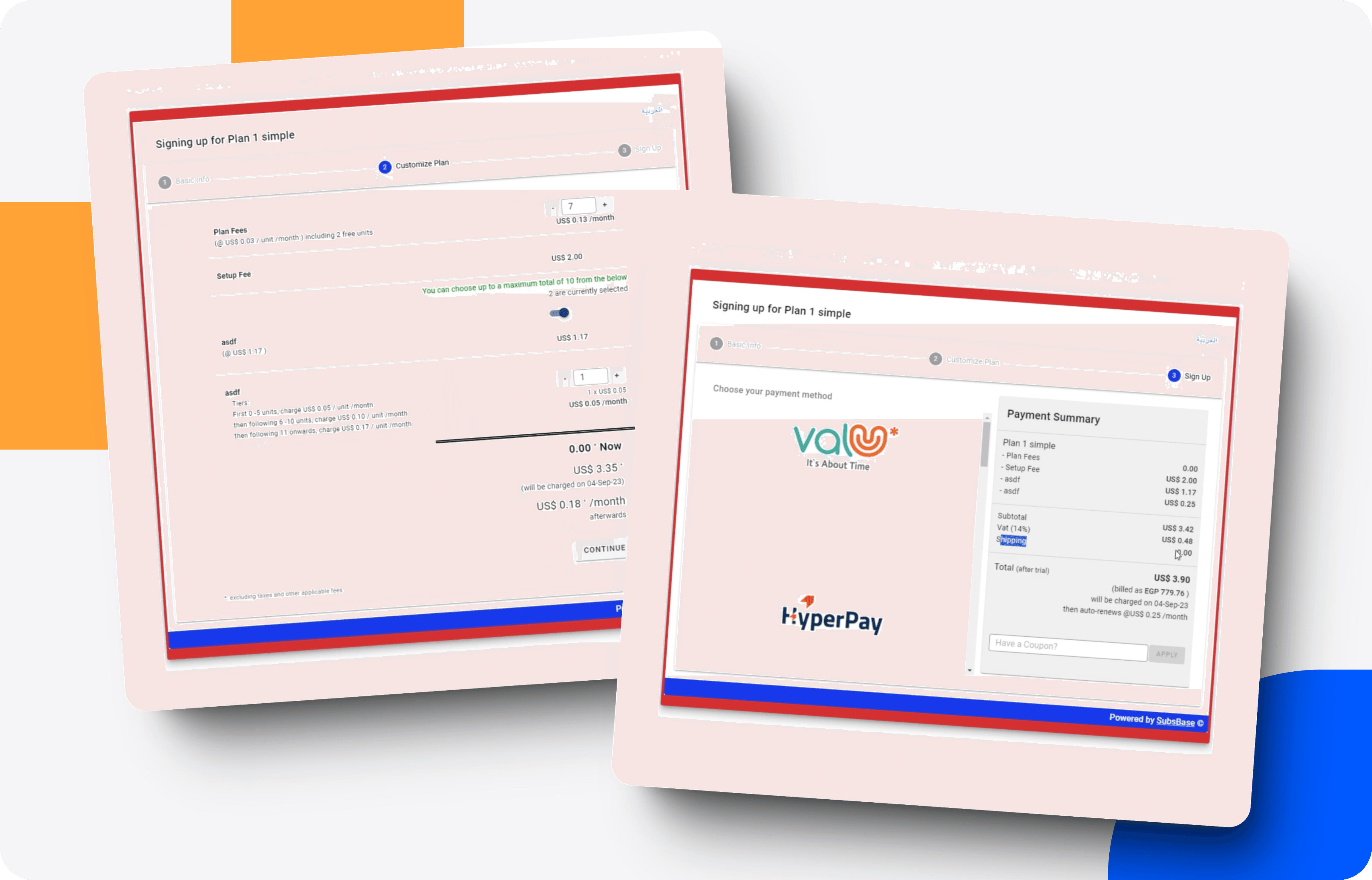
The starting point was a single-surface checkout optimized for one job: collecting payment. Plan fees, setup fees, add-on toggles, tiered pricing logic, coupon entry, and payment method selection were all stacked onto one scrollable page, a pattern familiar to legacy SaaS billing flows but one that forced users to commit before understanding what they were committing to.
Two weeks were spent inside two systems: the billing logic powering SubsBase's plan and add-on engine, and the existing checkout framework governing session state, coupon handling, and payment routing. Each merchant configuration could surface dozens of combinations of tier pricing, per-usage billing, and post-paid add-ons, meaning any new architecture had to scale across configurations without collapsing into complexity.
Usability sessions on the existing checkout surfaced three recurring patterns that shaped later decisions: users anchored on the running total as their primary trust signal, cost transparency was the deciding factor in completion confidence, and mobile sessions failed disproportionately because the summary sat far below the configuration surface.
User Flow
Before the redesign, every user, entered the same funnel: checkout page, configure, scroll, pay. The flow was linear, single-surface, and offered no staged commitment, users had no way to verify cost before being asked to pay.
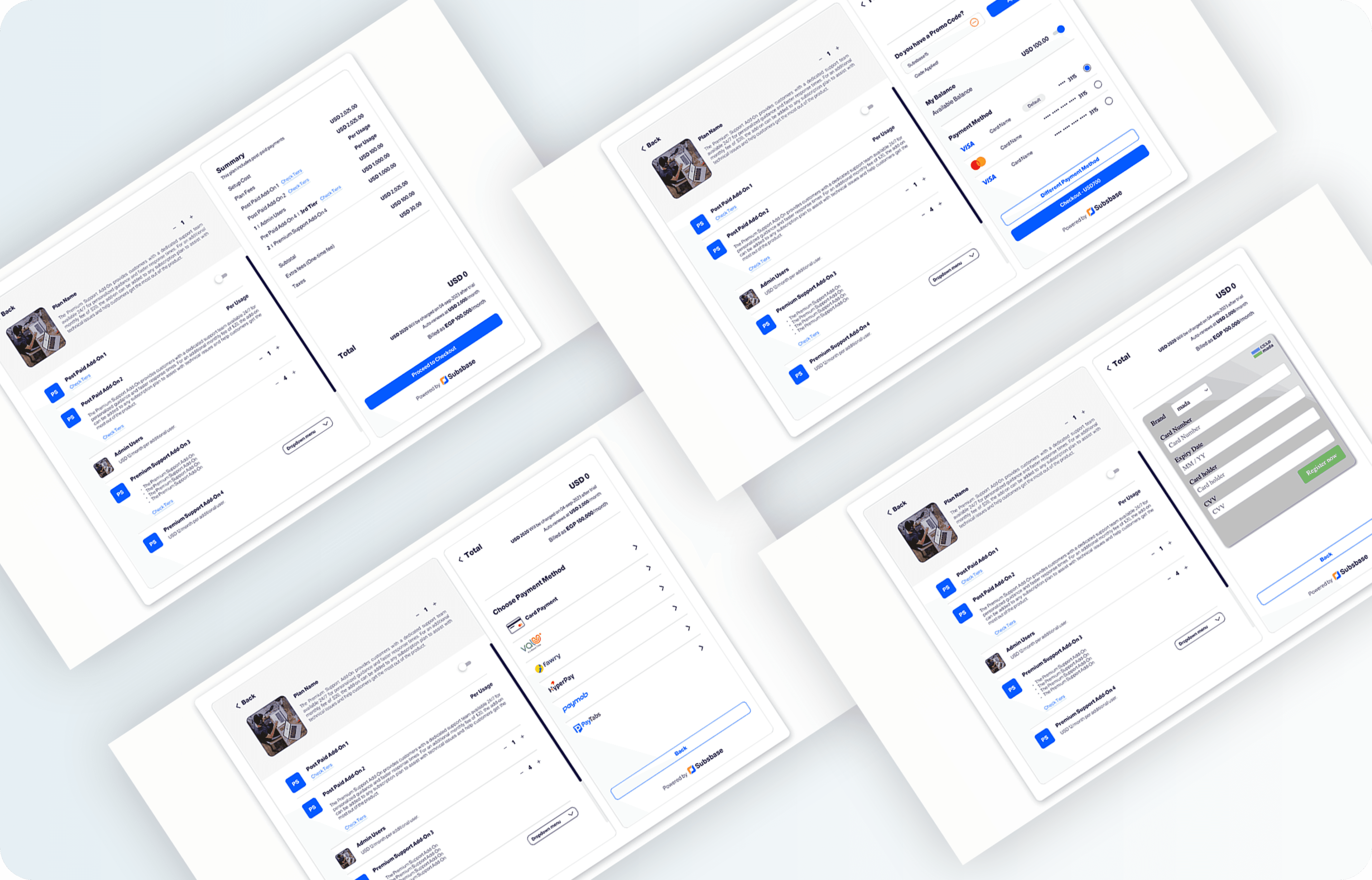
The new flow introduced a three-step architecture that treated checkout as a decision moment. Basic Info, Customize Plan, and Sign Up became distinct stages, while a persistent summary rail carried a live, continuously-updating total from the first interaction to the last. Cost transparency was threaded through every stage, so verification could happen at any depth of the session, not only at the final step.
Concepts, Sketching, Wireframes
The design process moved through five stages:
Design Thinking and Ideation: Sessions focused on empathizing with users and understanding their needs, leading to ideas that reframed checkout as a decision moment rather than a form.
Wireframing and Information Architecture: Wireframes restructured the checkout to prioritize plan customization and cost visibility. Information architecture was reorganized so users could move through the flow logically.
Visual Design: Colors, typography, and iconography were aligned to SubsBase's brand. Payment methods were redesigned to feel engaging and intuitive rather than utilitarian.
Prototyping and Interaction Design: Interactive prototypes brought the flow to life. Interactions were designed to guide users through the checkout without friction.
Responsive Checkout Redesign: The full experience was optimized for mobile, with simplified steps and touch-friendly navigation.
Test: Validation, Usability, Feedback
Prototypes were validated through user testing. Feedback gathered from sessions was used to understand user emotions, pain points, and preferences, then fed back into iterative improvements.Stage 5. Final Presentation and Documentation
Challenges & Conclusion
The main challenge was balancing customization options without overwhelming the user. Iterative testing helped find the right balance and reinforced the importance of user-centric design.
The redesign delivered a seamless checkout experience, addressing the original issues of clarity, customization, cost transparency, and payment engagement, across both desktop and mobile.

